keywords: a backpocket app, machine input, automation, ubiquitous, UX & UI
Google initially wanted to make a search engine that help users leave Google and go to places that they want to go. Is Google going in the right direction? Google now is providing users with flood of information, making users find it harder to leave the screen. p57
구글이 지금처럼 대중화되지 않았던 10년 전, 구글의 초기 설립자인 래리 페이지는 사용자들이 "구글을 벗어나, 가능한 한 빨리 원하는 장소로 갈 수 있는" 검색엔진을 만들고 싶다고 말했다. 그러나 오늘날 래리가 이끄는 구글은 그와는 완전히 반대 방향으로 가고 있다. "가능한 한 많은 정보를 제공하여 사용자들을 구글이라는 가상세계에 더 오래 잡아두고" 있다.
There are two kinds of apps.
1. Apps that help people get what they want and leave the screen as quickly as possible.
2. Apps that give way more than what people came for and make them stay in the screen as long as possible.
Many apps start as 1, but unfortunately progress into 2. For example, I may open an app to search, not explore. Google waits for my command, while Instagram bombards with information that I don't want to know. I find this 2nd kind an awful user experience. This book helped me stay alert on design practices that appear user-centered, but in fact not.
Think outside the Screen Box!
UX/UI designers in Korea are largely defined as designers who can draw out screens. Likewise the word ‘interface’ is largely defined as ‘screens’. This book is a great refreshment to designers as it opens up the possibility that not everything has to come out all square. We can incorporate various technology and come up with solutions with no interface, or screen. The author provides examples of sensor technology, IoT, RPA that use machine/automatic input (not user/manual input) to collect data and give alarms to users. The task is not to eliminate screens, but to keep them in your pocket.
A generation that thinks screens are old-fashioned
Millennials who have experienced both analogue and digital lifestyle, Z generation who was born with digital lifestyle, what lifestyle is next? Technology becomes invisible and intangible as it develops. In the future, our lifestyle may look just as it has in the 1990s with little or no screen because technologies have become ubiquitous.
If all you have is a hammer, everything looks like a nail-But first of all, get a hammer!
I try to learn things with an open mind, but not an empty head. I think Golden Krishna could talk about ‘no interface’ because he has a lot of experience with ‘interface’. He is currently a head of design strategy at Google, dealing with various Android devices (phones, tablets, TV …). I try to be careful when reading from the experienced, because although their words are relatable they may not fit my situation at the moment. As a beginning designer, it can help to draw squares or in some cases can’t help but draw squares. The most important thing however, is to always ‘think’ beyond screens. It is UX and UI, not UX/UI. Keeping the balance and living the life of a ‘Realistic Dreamer’; I think this is important.
It’s UX and UI, not UX/UI.
What it takes to call yourself a ‘design thinker’
Good designs solve problems. Great UX is not about making fancy UI, but creating a good experience for the users. You have to keep asking yourself whether you are making a beautiful screen or a good experience for the users. This is very much like the process of finding the ‘real needs’; you have to keep checking whether the problem statement is actually a solution. The famous Embrace story well summarizes this point — changing the problem definition from ‘how might we make a cost-effective incubator?’ to ‘how might we keep babies warm?’ has changed everything.
Our point of view was, “a desperate parent in a remote village who needs to give her dying baby a chance to survive.” We are going to rethink the problem from here. We would always come back to it and ask ourselves, “are we still addressing this problem?”
https://vimeo.com/embed-redirect/22342241
When you draw a box, you want to fill it.
When I moved from a studio to be bigger studio, I thought I could finally live a minimal life and enjoy the vacant space. Instead, I bought stuff to fill it up. When you draw a box, you want to fill it. When you draw a square, you get caught up in additive thinking and add ui components, which may just add digital chorses to your users. You might want to explore the problem more than enough, before the box becomes inevitable. In order to practice subtrative thinking and simplify the user experience, come back to your box regularly to see what you don’t need. It also helps to draw a ‘garbage box’ and try to fill this up.
https://www.youtube.com/watch?v=yQ4L7zCTG-M
Notable Quotes from Krishna’s talk:
A great UX designer? not someone who shows off screen shots, but who looks and understands users, speaks with user scenario and user journey maps…” — think out of the screen box and interact with people!
Because screens are so futuristic, right?” — we need to change the definition of technology!
No matter what the problem, we have the same answer.” — this is the same as having wrong ‘define’ of the problem
When are screens good? when they reduce time (eliminate digital chorse). Never, when they get user off typical processes, distract them and make them addicted.”
You exercise great Design Thinking, when you look at people involved in the scenario. Not screen, screen, screen, but people.” — the importance of empathizing with the end users
(with the example of a depression service) sensor data like when you woke up, call somebody… is accurate. A survey asking how you feel is inaccurate.” — the importance of collecting data, machine input/sensor technology
Principles of a Designer (by Golden Khrisna)
- Put down your mouse, first think about what people do. Observe their behaviors.
-The best start is observation.
-what are the pain points? → what are the needs?
-there are so many cases where it doesn’t have to be screen. - Do not serve the computer, make it serve YOU!
-Larry Page: “I’m a very lazy person. I make computers do my job.”
-“Thank you computer”, not “Hello computer”
-Machine input (Proactive Computing) > User input
-Make technology work for us, not us working for technology!
-automatic&nudgy data collection - Customize!
-services that study the user’s personal pattern instead of bombarding them with alarms
-hyper personalization
Nicely Designed Cases from the book


Personal Cases
Amazon Go
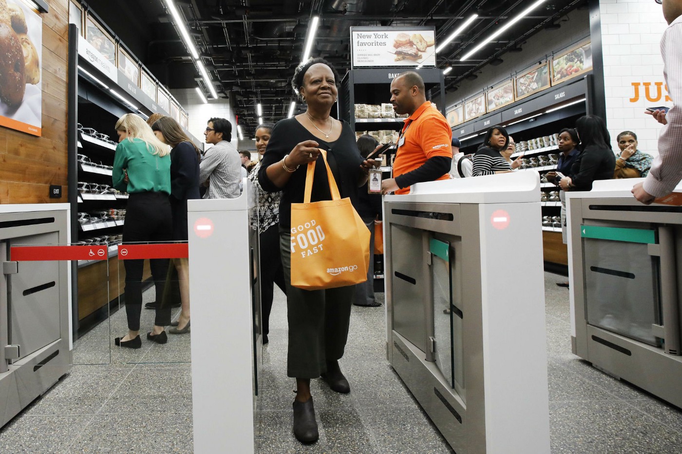
It doesn’t make sense to wait to pay. After reading the book, I thought of Amazon Go. I am looking forward to the day where you shop and just walk out the store. In Korea, almost all restaurants now have self-order/pay screens. These screens are supposed to fasten the order/pay process for the users, but in fact they are making it worse. There are still lines in front of the screen. Screen UI is complex for some, so it consumes ore time. Anyways having to stare at the new screen itself is labor. The screens only make sense if the users’ painpoint was having to interact with another human being. What if we take Krishna’s advice and actually observe people, find their greatest painpoint and start from there?
Incheon International Airport, showing off new screen

When I visisted Incheon International Airport in 2019, I found out they now do self bag drop. I had to focus on the screen to listen to the instructions. I think I touched the wrong button so I had to find an employee to reset the machine. What’s more, this whole experience made me nervous because I’m not sure if I’m doing it correctly. Like the self ordering screens in restaurants, I don’t think this kind of design can be improved. It does not shorten the process it intended to shorten. What it does is mostly re-orienting responsibility from the employee to the customer. I wonder if there was a major pain point from the original bag drop system that led to this design, or this came out to brag ‘technological’ advancement.
Apps should help people leave the screen! Why then obsess with retention?
One user review really struck me while I was designing a diet management app serivce. The review was that she's leaving the service because she reached her diet goal. Was I sad? No... I was happy for her. Many services start out simple but turn into addictive online shopping malls in the end and I understand that too. I am not so sure if retention is what apps should strive for. Maybe it's better to quickly give each user what they want and gain new user and repeat :)
인터페이스 없는 인터페이스 - 교보문고
사용자 경험을 품은 최소한의 인터페이스 디자인 원칙 | * 이 책의 대상 독자- UX/UI 디자이너, 프로덕트 매니저, 기획자, 경영자- UI 구현 시스템을 설계하고 프론트 환경을 구현해주는 엔지니어-
www.kyobobook.co.kr
'read' 카테고리의 다른 글
| nendo의 문제해결연구소 2F-아이디어에 대하여 (0) | 2021.09.14 |
|---|---|
| nendo의 문제해결연구소 BF1ㅡ1F (0) | 2021.09.14 |
| ?!?! 질의응답식 글쓰기(책 '바바라 민토 논리의 기술 The Minto Pyramid Principle') (0) | 2021.09.12 |
| 노력하면 성과 나는 구조로 일해라 (책 '무인양품은 90%가 구조다) (0) | 2021.09.12 |
| 평범한 진리를 비범하게 실천하기-'서른여섯, 은퇴하기 좋은 나이'를 읽고 (0) | 2021.01.17 |


댓글